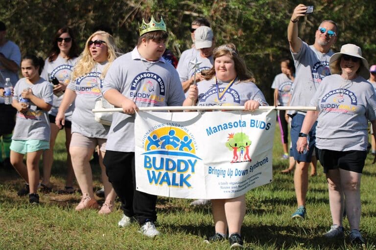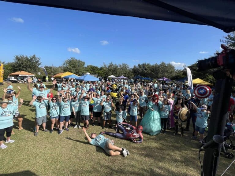
Manasota BUDS Rebrands
BUDS introduces refreshed logo and colors!
In celebration of Manasota BUDS’ 20th year of service, the organization has turned a new page, introducing a new logo with added versatility, as well as modernized aesthetics, typography and colors.
The logo features 3 characters, a tribute to the 3rd 21st chromosome that is common in all persons with Down syndrome. Varying colors are used to represent the diversity within our organization. Bodies resemble the outline of hearts, representing the love we share for our families, and our cause. Arms meet in the middle of the logo to represent friendship, togetherness, and inclusion. Panning out, the logo resembles the outline of a shamrock, because we feel lucky to be a part of the Down syndrome community.
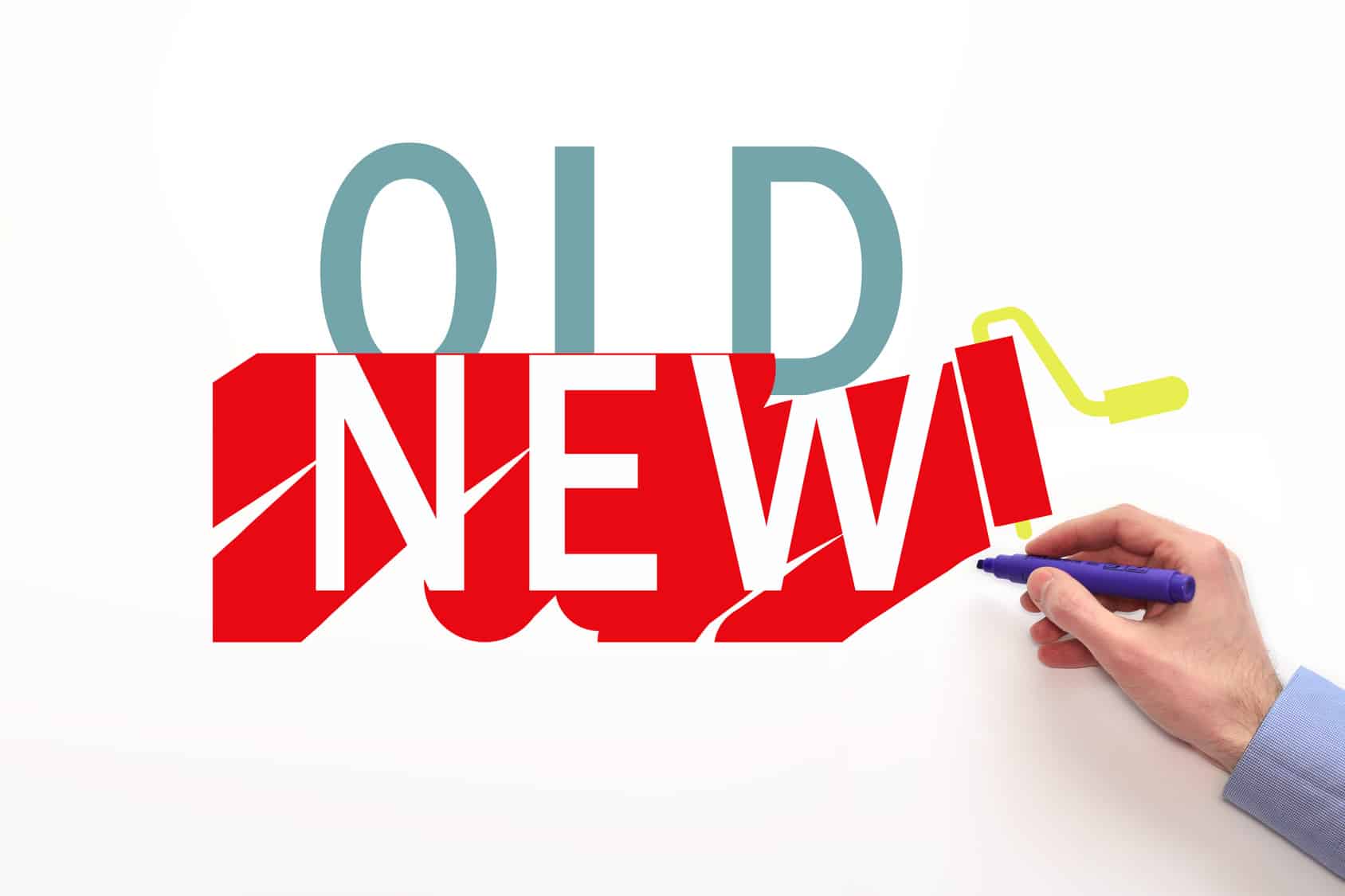
Elements of our historic logo will remain integral to the Manasota BUDS story, and will be regularly utilized throughout the organization’s creative. That logo, created by a founding Manasota BUDS parent, has faithfully served the organization for over 15 years. We are extremely grateful for the history and brand equity garnered from its design!
We hope that you all enjoy the new look!